Better Together cut files
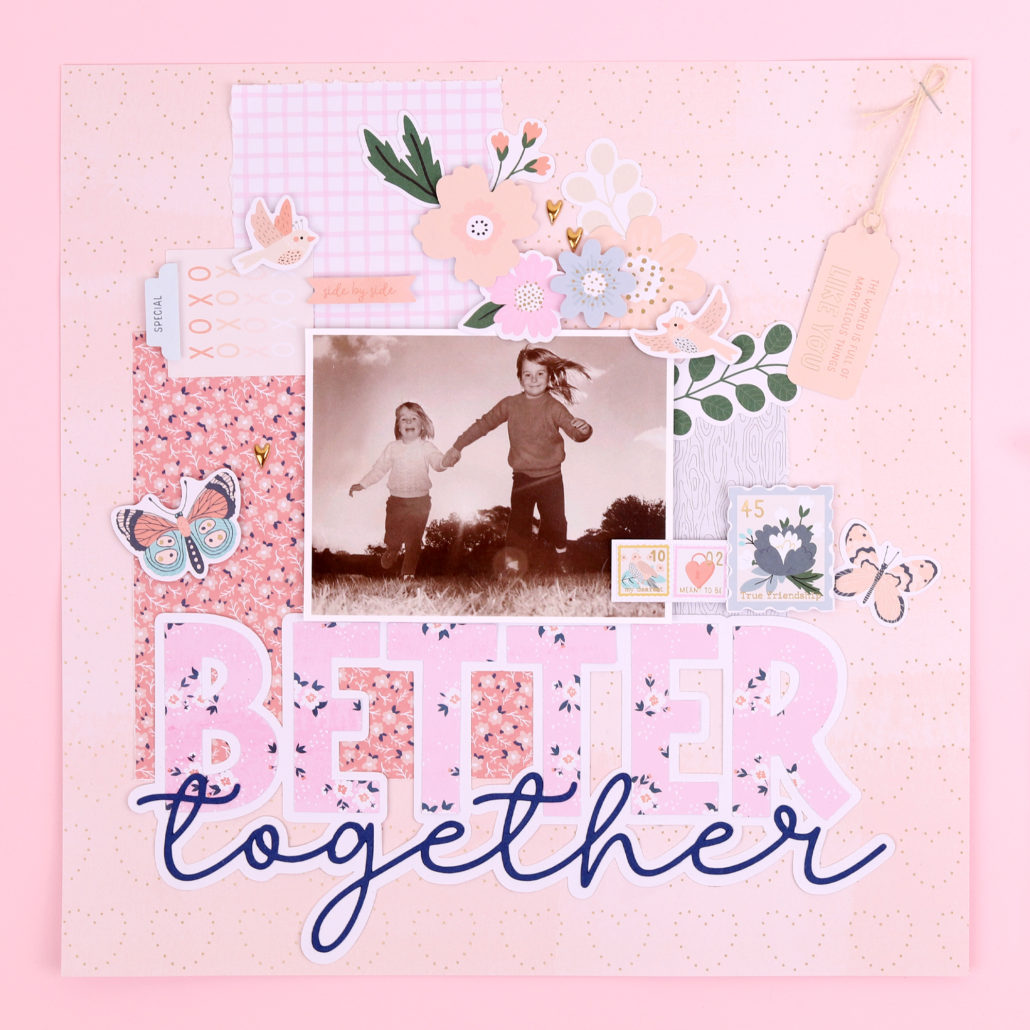
12×12 layout – Tracy Britton
Just to show you the cut files in use! We’d love to see what you do with them… tag us #rosiesstudio
My 12×12 layout has the Better Together file used at around 250mm (10″) wide. I’ve used the 12×12 pad for the pink “BETTER” and the background foiled hearts paper. The other 3 papers used are 6×6 papers. and I’ve used a ruler to rip the edges of them, to give them a textured, less formal look. The florals, birds and butterflies can all be found in the diecut ephemera. The tag, divider label, banner and xoxo card are all diecut sentiments. The stamps are from the Cardstock Sticker Pack and are glued onto plain white cardstock. I’ve also used the foiled puffy hearts from the Puffy Foil stickers. This is my first ever 12×12 and I’m so happy with the result. I think the large cut file makes a great focal point.
Also: Check out the adorably fat little bird!!

cards and layouts
Head on over to Diane’s social media for unboxing and tutorials, or ask about your favourite papercraft project of hers.
Instagram: @dearlydee
YouTube: https://www.youtube.com/dearlydee
Patreon: www.patreon.com/dearlydee
12x12 layout
Rosie’s Studio – Lissa Rees
Another wonderful 12×12 layout by our amazing Lissa Rees. Lissa used a few of the silvery grey elements from Better Together to highlight the beautiful silvery fur of her 15 year old Labrador Coco.
Lissa’s sued the Chipboard Frames, Puffy Sentiments, 12×12 Papers and both sets of diecut ephemera.
